Posts

Here's one I made earlier...

Image
Wow, it's been a while since I did a blog entry. Four months maybe? Since joining Graphic News and moving to a temporary home, I've been too busy to do one. The only reason this is going up now is because I've been off work sick today! My old Globe And Mail work colleague Dean Tweed, asked if I'd been moonlighting for my former employer when he saw this graphic in the paper today. (click to enlarge – also, Globe online version can be found  here ) Er, no, I haven't. This is a graphic I did back in July 2009 when the car and bodies were found. I remember it being a super-tight deadline and only just getting it out in the scant few hours I had. But it's nice to see it get a second life and good to see it was on the money and required very little "verdict tweaking".
Back by popular demand...

Image
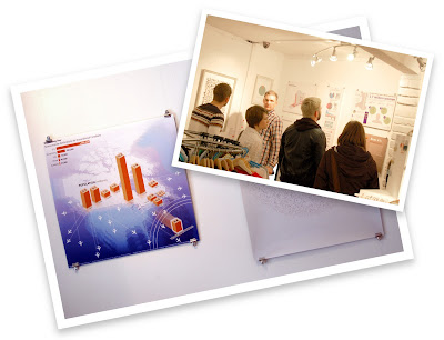
(Click for clearer view) Further to an earlier post : the Cardiff Design Festival infographics exhibition (featuring that blue North American graphic thingy of mine, above) has now ended. However, it was such a success that festival directors requested it be moved from the Sho Gallery to their headquarters at the Cardiff Story Museum in the city centre to give it more legs. The exhibition will restart there on Thursday and run until November 9. Who knew infographics could be so popular?!

One in nine million...

Image
I was web surfing away the other night when I stumbled upon a banner advert for istockpohoto.com . Imagine my surprise when I saw one of my own clip art items that sells on their website appear in the ad! (Click for clearer view) This is either phenomenally lucky (since they claim to have 9,000,000 images up there), in which case I'm off to buy a lottery ticket and scratch card right now, or somehow they're using my browser's cookies to display images it knows I designed. Whichever is true, it's a little freaky and weird. BTW, my istock portfolio can be found here , if anyone wishes to increase my pocket money!

The most unnecessary of infographics...

Image
I've seen my fair share of bad taste infographics in my time – usually perpetrated by newspapers – so I have to take my hat off today to Gulf News  in Dubai for really scraping the bottom of the barrel with this humdinger. There's so much wrong with this that it beggars belief. And the artists even put their names to it at the bottom! Thanks to Yanthe Harper for spotting it.

Infographic clichés...

Image
People who know me would attest that I'm not a fan of the 'wall-o-pies' style infographics that are plaguing the web at the moment (in fact I wouldn't even deem them to be infographics at all). You know the sort of thing I mean – huge, tall vertical graphics that scroll downwards forever, full of stick people drawings and endless meaningless drivel statistics that just confuse, bore and turn off the reader. So it was a joy today to come across an infographic that ridicules the trend. Congratulations to Alberto Antoniazzi for his sense of humour and to Bridget O'Donnell for tweeting the fastcodesign.com article. –––––––––––––––––––––––––––––––––––––––––––––––––––––– October 4 update: Just spotted this rant by Gizmodo about about crappy infographics. The tide is turning... hopefully. Click here to read it.

Global treasure hunt...

Image
There's what sounds like a great new treasure hunt book out this month, reminiscent of 1979's Masquerade which kick-started the whole 'armchair treasure hunt' fad (see also this Daily Mail article ). Oddly, I never really got into this one, but I do remember the family being driven absolutely bonkers for a year by 1983's  Conundrum – The Cadbury Creme Egg Mystery . We had to eat heaps of the sickly sweets and send off the wrappers in order to receive a book which contained a dozen word and illustration puzzles – each one leading to its own £10,000 golden egg buried somewhere in the UK. The latest addition to the genre, The Great Global Treasure Hunt on Google Earth , is available as two print editions or an iPad ebook – although the latter is absolutely awful and I advise you not to go near it. As the title suggests you look at cryptic illustrations and text riddles to solve puzzles that point to Google Earth locations and ultimately an overall solution ...

Infographics as art...

Image
I've been invited to exhibit an information graphic at the Cardiff Design Festival next month. The exhibition at the Sho Gallery in Wales, opens on October 4, with the theme of "current trends in information visuals". The infographic they have selected was published at the end of July last year for The Globe And Mail newspaper in Canada, and highlights the number of Canadians who live abroad. The brief was to design a page-holding image for the front of their ROB business section to accompany the  main article on ex-pat entrepreneur Yong Hui Li.

An unfortunately timely reminder...

Image
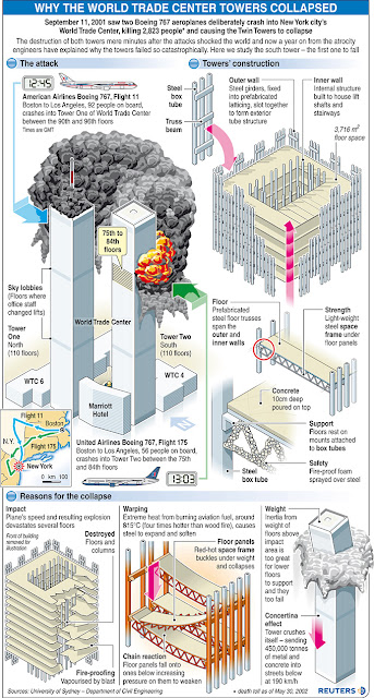
It's sad when a portfolio graphic is on a topic as ghastly as 9/11, but sometimes they are and sometimes they become timely again and should be dusted off and aired once more. Published August 21, 2002 I did this one for Reuters almost a year after the attack, when investigators had had a chance to decipher what had failed so terribly with the construction of the World Trade Center twin towers. I remember it being a very time-consuming graphic as I wanted to get every detail (as was known then) correct to the best of my ability. –––––––––––––––––––––––––––––––––––––––––––––––––––––– Eleven months earlier, on September 11, 2001, I had been doing a rare light feature graphic for Reuters – most of their topics were of a more serious nature, but occasionally we were permitted to do something less hard-newsy. Mine that day had been a graphic intended to show the benefits of a new video game console that was about to launch. It was about 2pm in London and I was just sta...

When a newspaper lays-off half its graphic artists and designers...

Image
... you get page one presentations like this! Take a look at today's The Sydney Morning Herald front page. Looks okay, I suppose. A bit dense and text-heavy perhaps. Not a lot of visual pizazz. But they do have an interesting (if pretty grim) main picture. But wait, what's with those arrows? It looks like someone's child has 'air-brushed' (badly) an arrow in Photoshop and plonked it onto the photo a few times using their pagination software (Cyber, I think it's called). Clicking the above rag-out enlarges it to reveal how Press Display picks up the text and image boxes overlaying the image too. It's not very slick, is it? Actually, it's laughably hideous, utterly unprofessional and rather humiliating. Unless of course I'm missing a 'graffiti redesign' announcement. Fairfax Media , The Sydney Morning Herald's owner, recently laid-off half of the title's graphic artists and designers, with the money saved from these job cu...

Graphic News workshop...

Image
The week I begin working for  Graphic News  will see them celebrate their 20th anniversary – on Friday, October 14, 2011. To celebrate this achievement, they are holding a workshop entitled Graphic News in Motion in London. Whether you're a subscriber to their service or not, you can attend this unique opportunity to network with your peers by visiting this  website  for further details (there may be a fee for non-subscribers). The day will comprise of a workshop featuring key speakers from our industry, a networking session and evening reception.